|
Optionslam.com |
|
|
|
|
|||||||||||
| Log In | Join US | ||||||||||||
|
||||||||||||
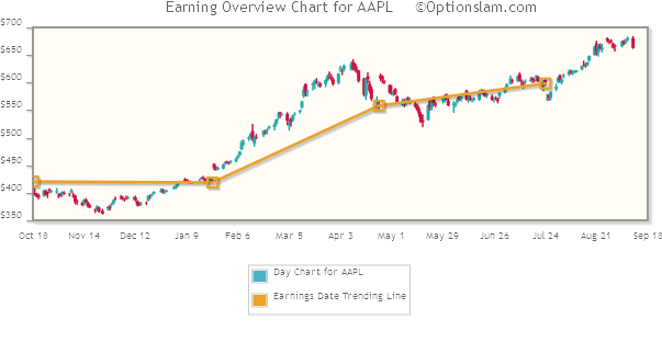
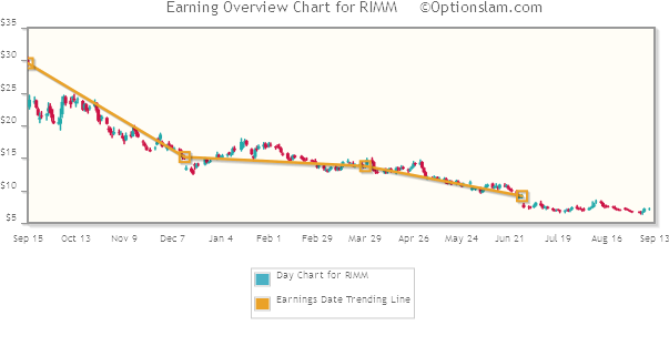
Earnings History PageAt the top of a stock’s Earnings History page is the stocks Earnings Trend Line chart. For the ‘big picture’ view, this is a one year daily candlestick chart. A yellow square is plotted at the close of the day immediately prior to each Earnings Release. A line is drawn from ER to ER highlighting a stock’s price direction in relation to Earnings Releases. See below for two examples of the Earnings Trend Line chart.
Located at the bottom of the Earnings History page is the Earnings History Table. This table provides critical information regarding a stock’s price behavior immediately following each Earnings Release. Stock price open, high, low and close (ohlc) are cataloged here for two time periods: the one trading day immediately following an ER and also through the front month Options Expiration date. Maximum moves and Final Closing moves are also represented in percentage terms as they relate to the Pre Earnings release closing price. Our extensive data base provides information on most stocks all the way back to 2002. Traders use the specific information available here to better choose their strategy as well as strike selection. Knowing how a stock has behaved on past Earnings Releases is the best clue to what can happen in the future. |
About Us | Site Map | Strategy Testing | Disclaimer | Contact Us | Copyright © 2003-2026 Optionslam.com LLC, All Rights Reserved. (AWS10t) |
||
 Site Help
|
Site Help
|